logo
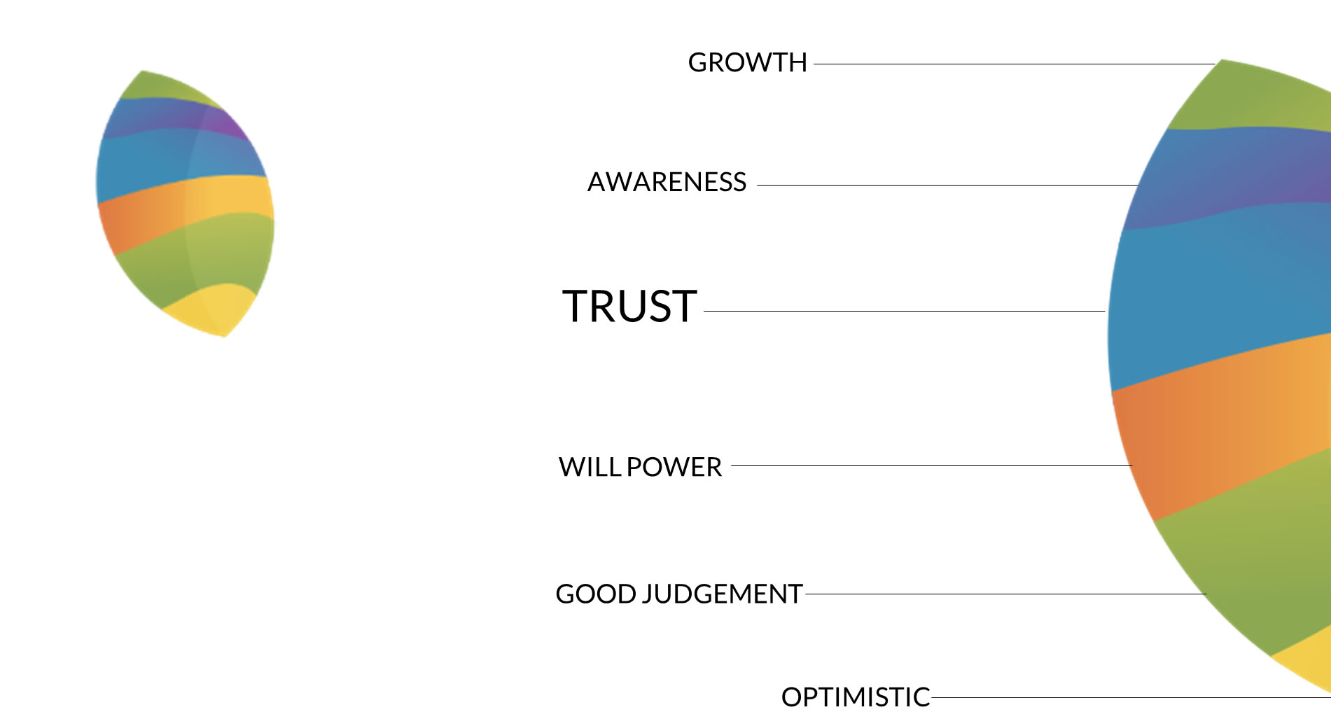
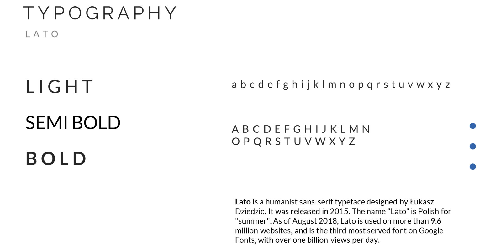
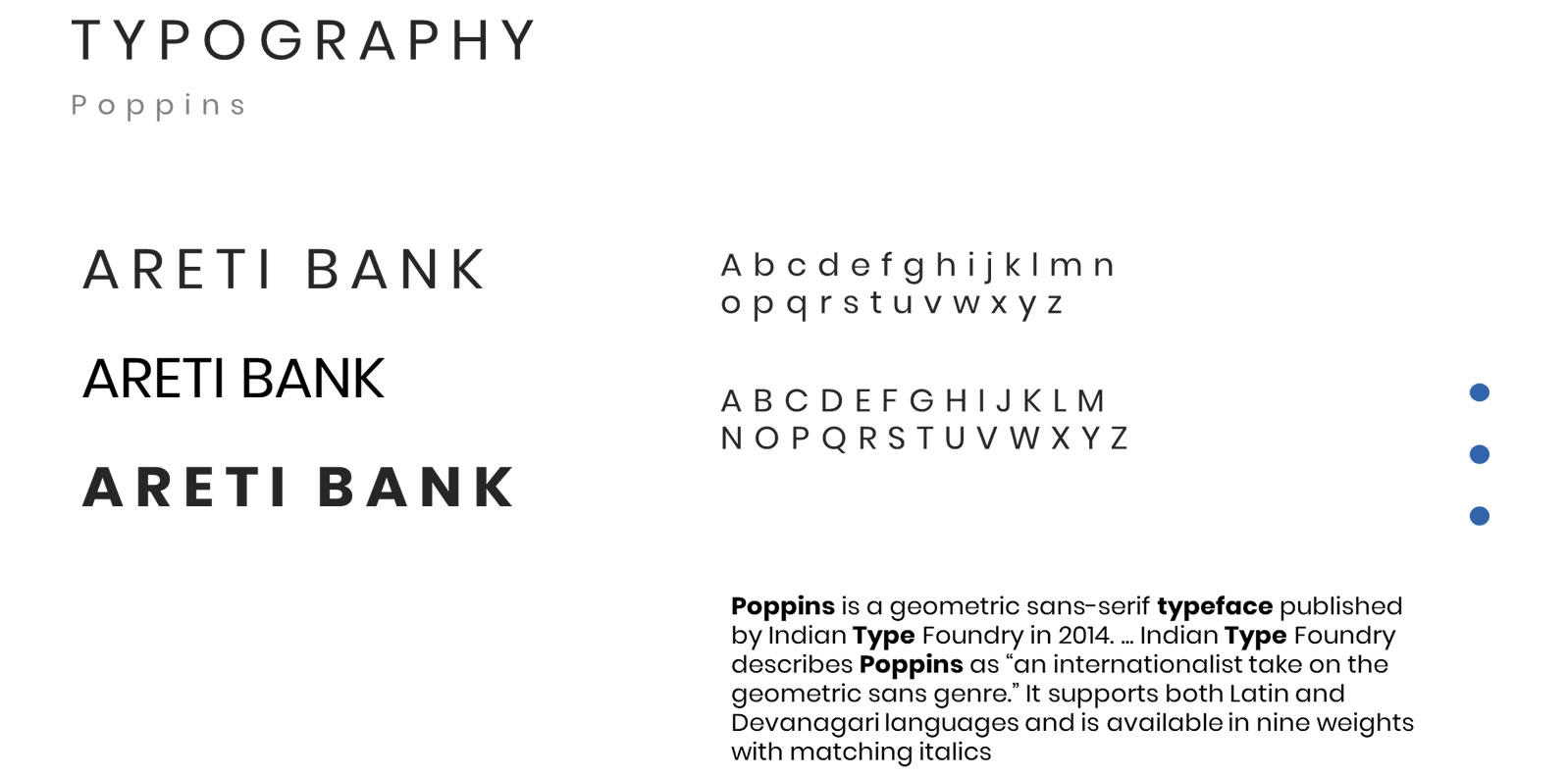
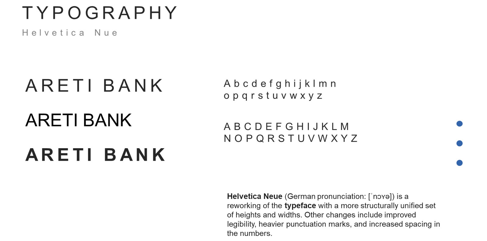
Simple and sophisticated design, with a very modern look, highlighting the name ARETI as the most relevant element of the logo, and using a smaller reference of the word bank, which is purposely located in a very “uncommon” position, with the sole purpose of keeping the harmony but yet breaking the expected locations other brands could have used. Helvetica Nue, used for the bank, while the main part of the logo uses a variety of fonts as a primary reference, but the details on the design were handmade by the artist. The isotype, or symbolic or iconic part of the brand, is a visual abstraction that represents all the elements of the brand throughout different colors and gradients (Growth, Awareness, Trust, Will Power, Good Judgement, and Optimism).

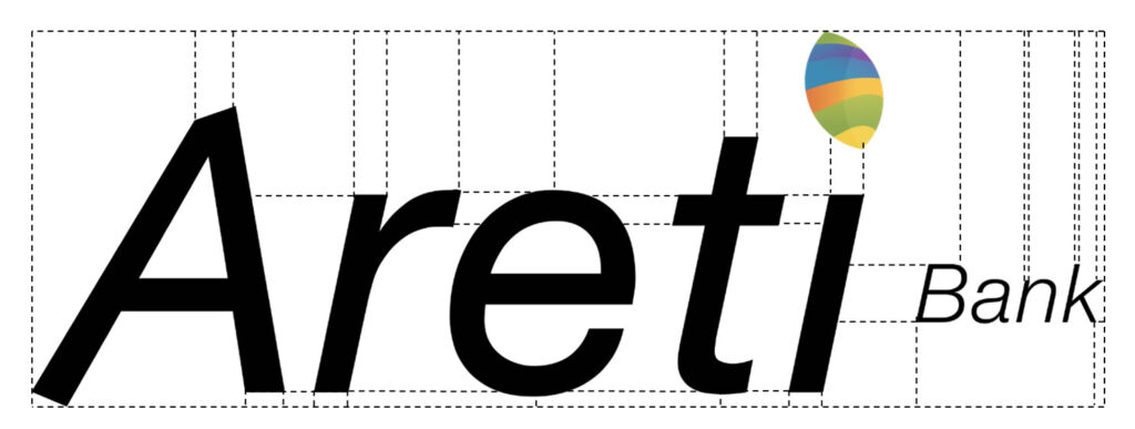
CONSTRUCTION
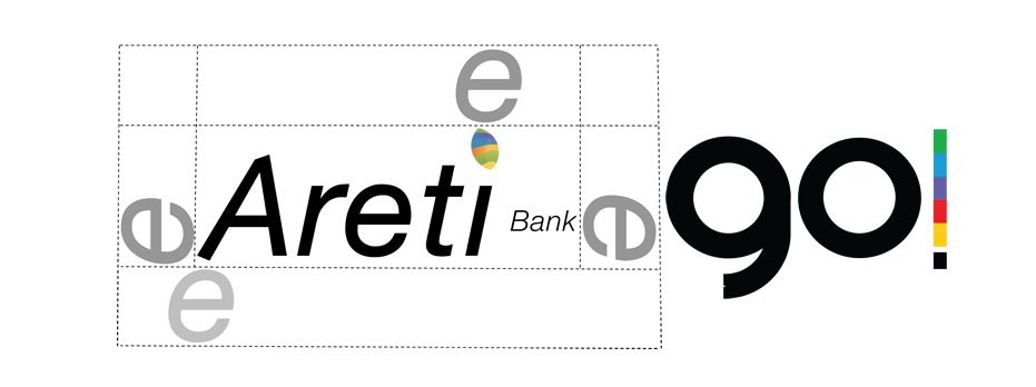
A slightly taller letter (A) purposely leaning to the right, with an angular cut on top, provides the sense of direction to the Wording. The letter E, in between the R and the T, provides the “Ecuator” effect to the logo. The Isotype acts not only as the dot to the letter I (Lower Case) but also as the most exposed and higher element of the logo. The single-color mark, compensates for the small yet powerful mark, to define the ideal balance of the logo. Again the word bank, still a powerful element of the brand, remains on a corporate font, and a unique modern location right in the middle of the logo, at the same height as the E from the main word.
CLEARSPACE
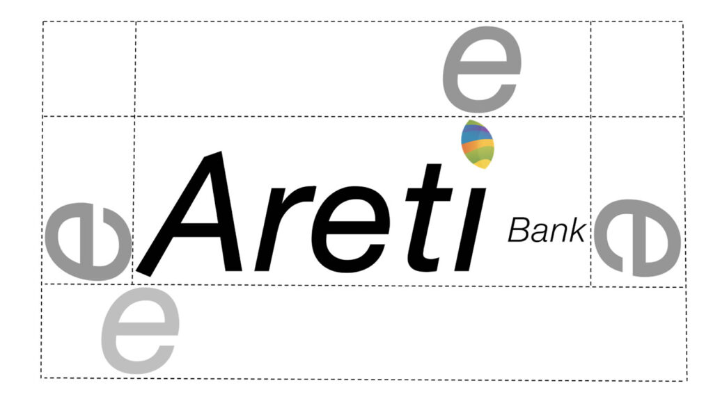
The clearspace of the logo equals the height of the letter E across any direction from the logo, using the left “leg” of the letter A as the lower and left-most locations, the top of Isotype as the upper-most, and the K of the word bank as the right-most location of the logo. The only exceptions are when using just the Isotype, for example, an App Icon.
COLOR AND SCALE
The logo must be white on darker or colored backgrounds, and black on white backgrounds.
Logo design can scale to 75 pixels wide on digital, or .5 Inches on print.





PARTNERSHIPS
Partnerships should follow the clearspace rules.
LOGO TREATMENT
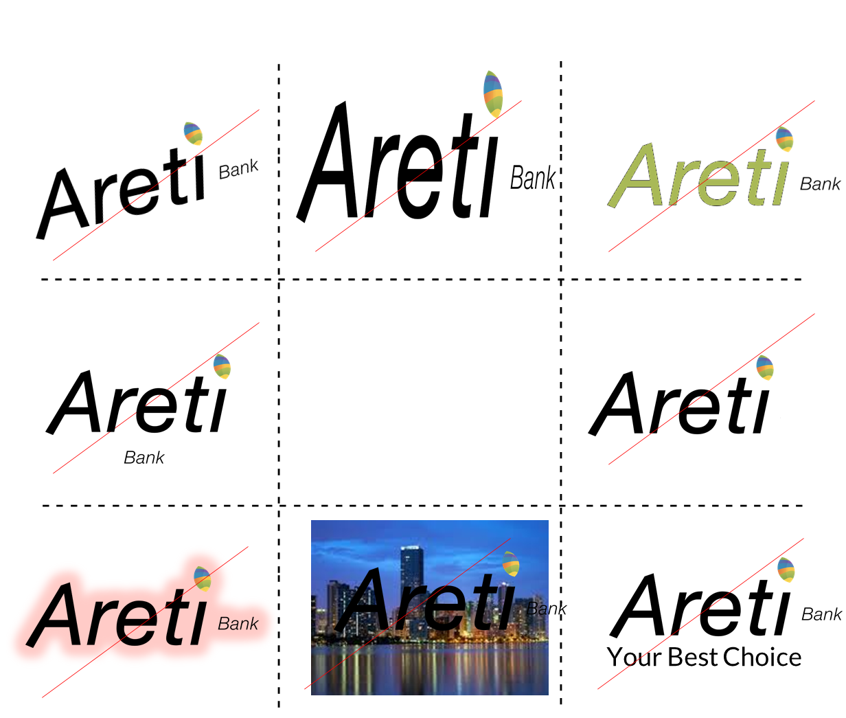
The logo must be used as is and not be altered in any way. This means that you must not:
1)Change the logo’s orientation or rotation.
2)Disproportionately scale or resize the logo.
3)Change the logo’s colors.
4)Display the logo in a configuration not previously specified.
5)Make alterations to the logo’s text.
6)Add special effects to the logo.
7)Use the logo on top of busy photography.
8)Display other elements within the logo’s designated clear space.
PLACEMENT
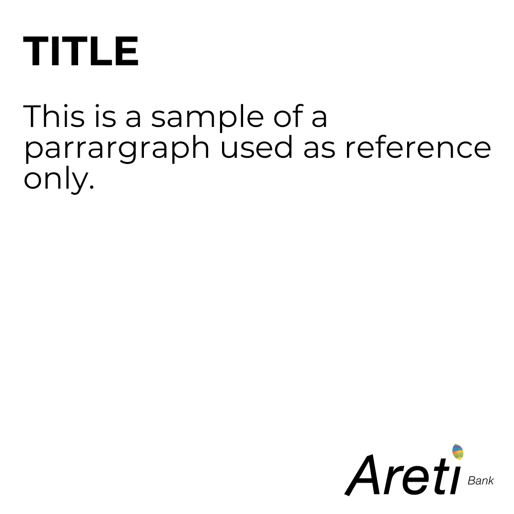
There is not a specific placement of the logo, it solely depends on the communication element and use. We do suggest maintaining balance and place the logo if possible, on the corners and not in the middle of the piece to generate a balance.
COLORS
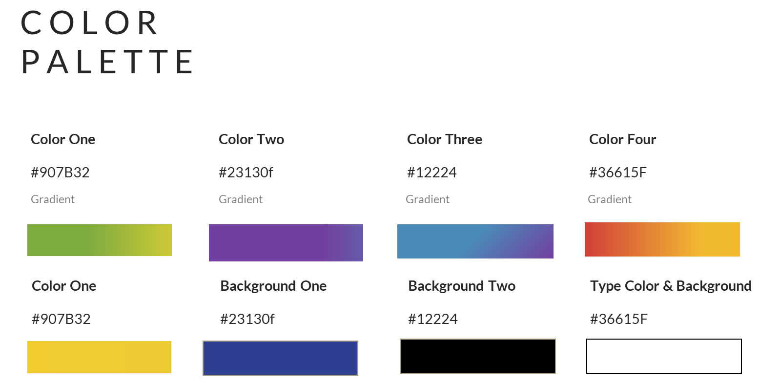
The middle colors represents the old layers impacted by men without a consciousness for our world.
The new blue and green colors represent the layers Areti BanKk will help create by empowering the new generation with the means to make a change.
corporate COLORs
typography
TONE AND VOICE
An energetic tone in branding, reflecting the immediate need for consciousness and love for the environment must be reflected on every single element of communication.
A friendly voice calling for mutual collaboration, and a mutually beneficial relationship.
CORE
Conscious: We care about our future
Positive: Yes, it’s possible
Friendly: Together we will make a difference
SUPPORTING
Digital: Accessible 24/7 3 clicks away
Visionary: Doing good is in our DNA

APPLICATIONS
There are several factors that are very important on the application:
#1) The use of the “leaf” as part of the communication is vital. It must be used with creativity, not only applied as the Isotype but also as a silhouette or transparency. It provides a unique identity to our communication.
#2) The Sustainable Development Goals, will play a vital role in our communication, meaning the color palette and the LOGO will be part of our communication.
#3) The main colors of our brand are determined by our Isotype colors and gradients, when applying the Sustainable Development Goals individually as part of our communication, we will use the colors of every different goal, with white fonts and transparencies or filters using the leaf.
#4) When referring to our products and services, we MUST reflect DIGITAL, TRUST, TECHNOLOGY & CONVENIENCE.
BRAND STORY
Let's write a story together
and share it with the rest of the world!


SOCIAL ICONS
Icons are designed based upon specifications and will ONLY use the Isotype.